Issue Preview Bonanza
August through December, we barely knew you!
If you are new here (hello!), or if you are old here (also hello!), you may have noticed that the sort of heart/soul, bread/butter, peas/carrots of this operation—the print zine that paid subscribers receive in exchange for their support each month—came to a sudden stand-still after July. I’m not *much* of a sharer, but I have made what I personally consider to be pretty overtly and outsized reference to the passing of my stepdad and the grief-induced inertia which came from it. Me notwithstanding, the big losers of the grief-inertia were our much loved, prized, admired, exulted (?) zines!
So. Today I’d like to show the group a little of what the cohort of zines we got lost in the churn have going on. It’s a lot. They are sweet and beloved because wow what a time capsule and a little glimpse of creativity tucked in between some darker stuff. The proverbial flower in the sidewalk, life finds a way, etc and so on.
For more on all that, I’d love to draw your attention to a post that really resonated—and prompted a great “grief, productivity, oof,” conversation between
and I. The way she delicately but so-accurately described how loss and internet-work can chafe was really helpful. Recommended if you, too, find yourself in this spot.And now, onward—or, well, backward.
August 2024
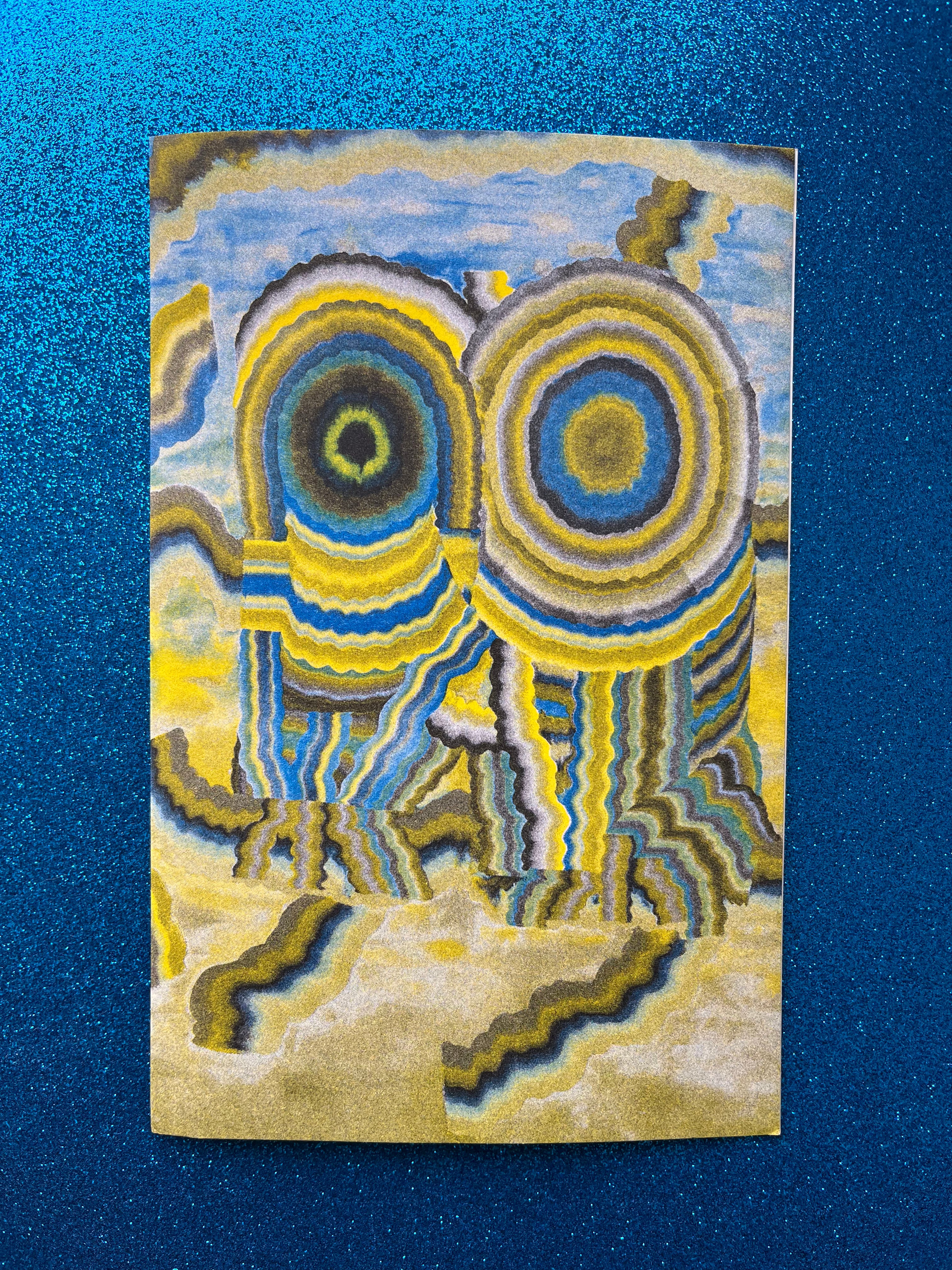
The August issue featured a print by Glen Baldridge, whose work has appeared here in the past. I love this particular series by Glen and, Riso file-maker master that he happens to be, this particular print is just so very extremely and extraordinarily good. I hope you can tell from the photo, the color selection and vibrancy is so nice. Thank you Glen!!
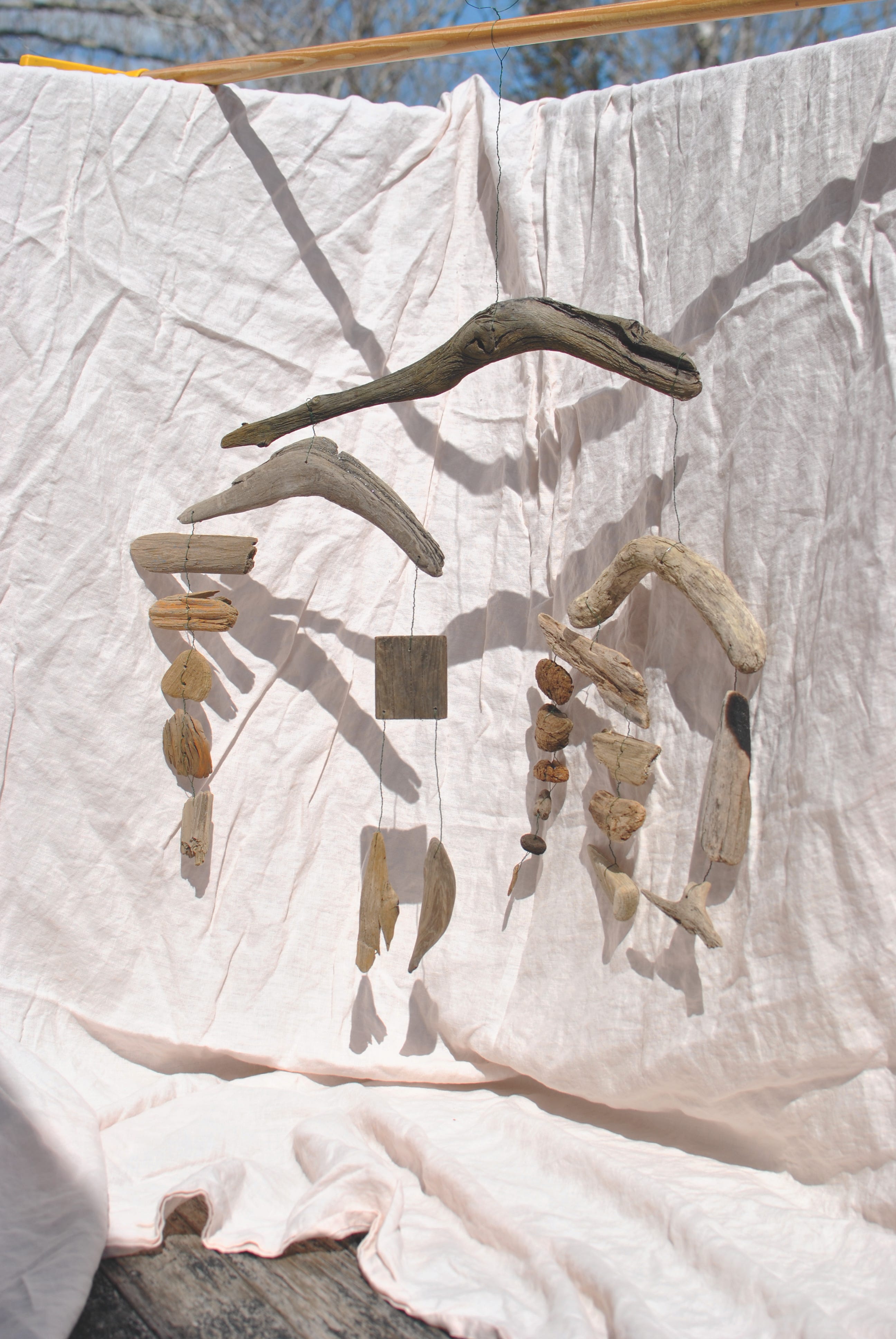
Inside, we start with a project inspired by one that hangs in my aunt and uncle’s home—a mobile made from found driftwood. There’s a beach nearby that has top notch shards that tend to wash up, some that are so smooth and round, they look manufactured. I wanted to try my hand at making one, which was more complicated than I thought it would be! I ended up weighing each of the groupings and sub-groups to make sure the mobile would hang evenly on each side. I’m sure there are other ways to do this, but it’s what worked and make sense for me.


Then I really lost my way, my mind, and made extremely intricately cut quick pickles, inspired by some of the beautiful decorative vegetables that sometimes accompany a bento box. They were a little sad to eat, but all things must pass, including radish toadstools and carrot seashells.
September + October 2024
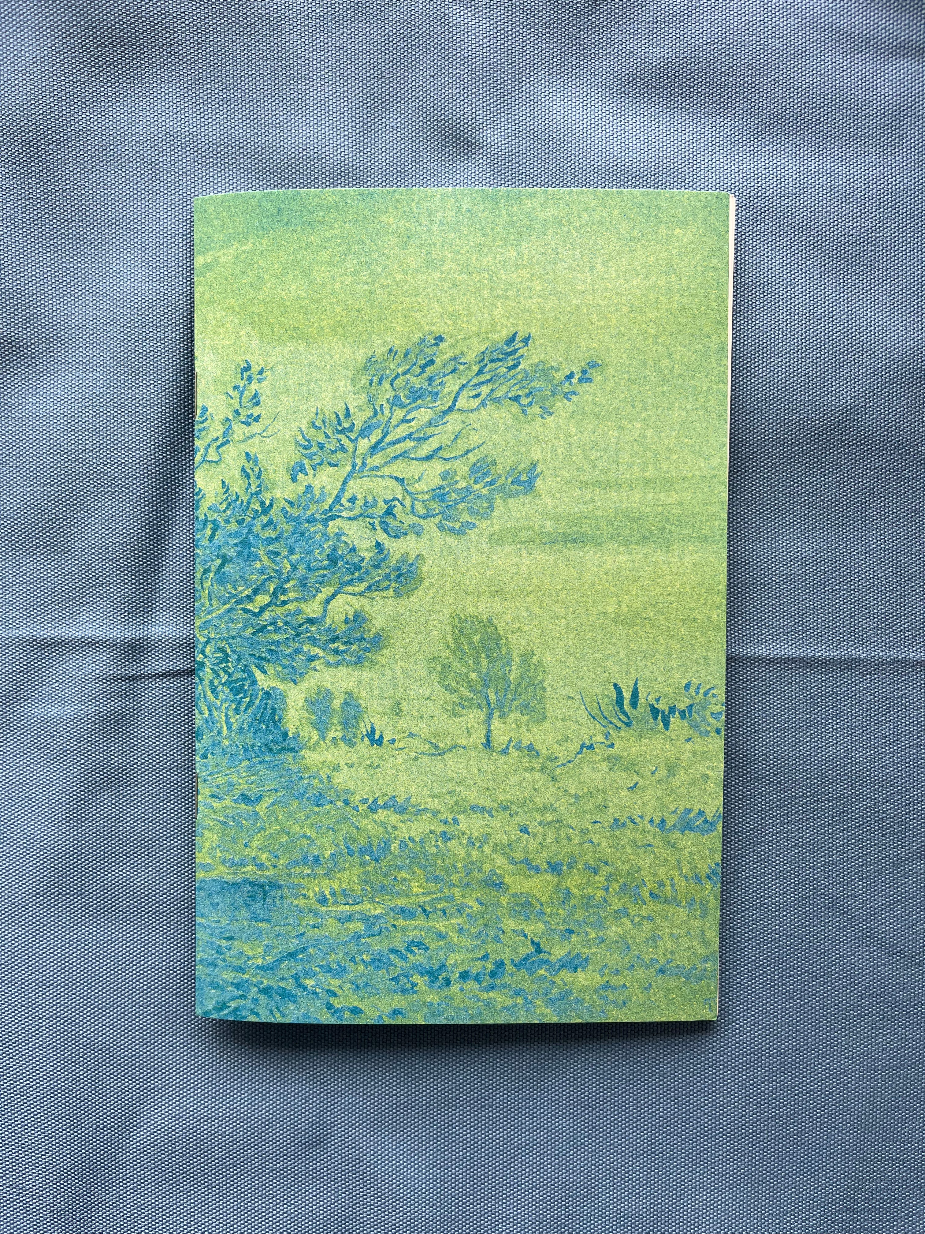
Lacking time and bandwidth, I turned to the Metropolitan Museum of Art’s open access collection—shoutout to Maeve for tipping us off to this incredible resource!—for this next cover and messed around with the Risograph ink combinations. I ended up choosing an ink painting by Theodore Rousseau, done up with cornflower blue and mint-green. The physical result is really beautiful and reminds me of some of my aunt Camilla’s seaweed prints, seen here. Success, despite time and bandwidth, can you imagine?

Inside, I start with photos from my own garden and the tips, facts, and process I used—at least this year!—for putting everything to bed, setting myself up for “success” (?) this spring in the process. I also included extra bits about tool clean-up and maintenance.

Then, a photo essay of found beach structures I took on film in Big Sur, California. I just love these little buildings and take photos whenever I get a chance. I love the instinct and vernacular of a temporary beach shelter.


Last, because we’re representing October here, I did a little series involving masks. I created six masks using various materials, and had friends wear them in their sort of “usual” environments and everyday clothes. So, the only thing different is that they are somehow for some reason wearing an elaborate mask. I’m so happy with this series, hope it brings you some weird and uncanny joy as well.
November + December 2024
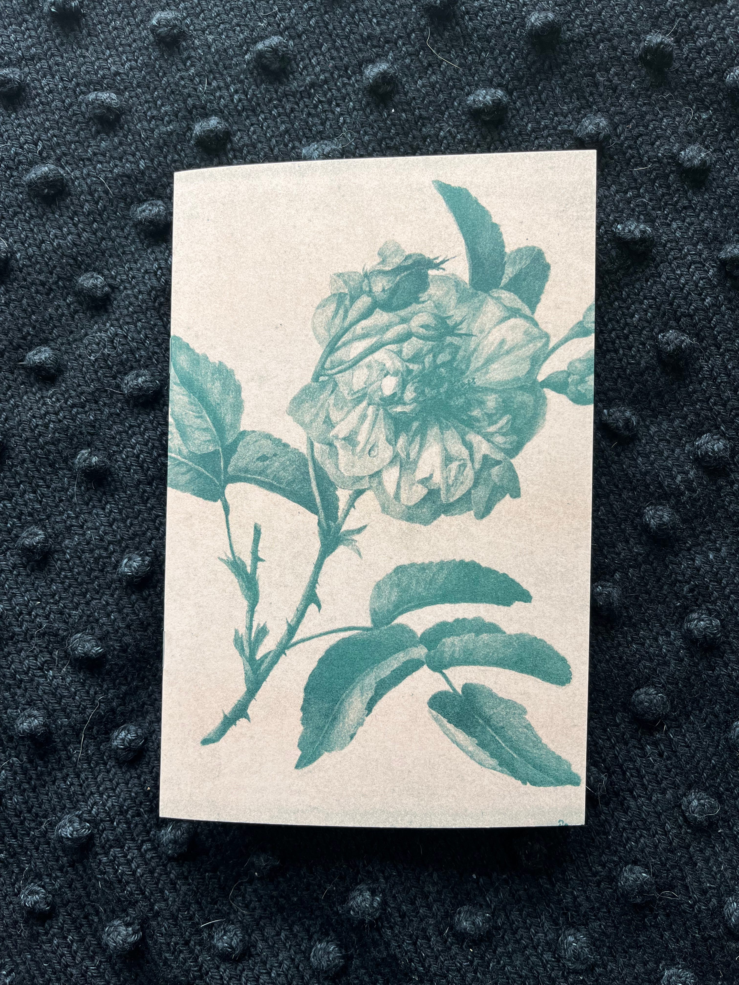
I dipped back into the Met collection for this cover, selecting a pen and ink drawing by Anne Vallayer-Coster, called “Two Roses.” Beautifully printed by Risolve Studio, per usual, in Bisque and Hunter Green.
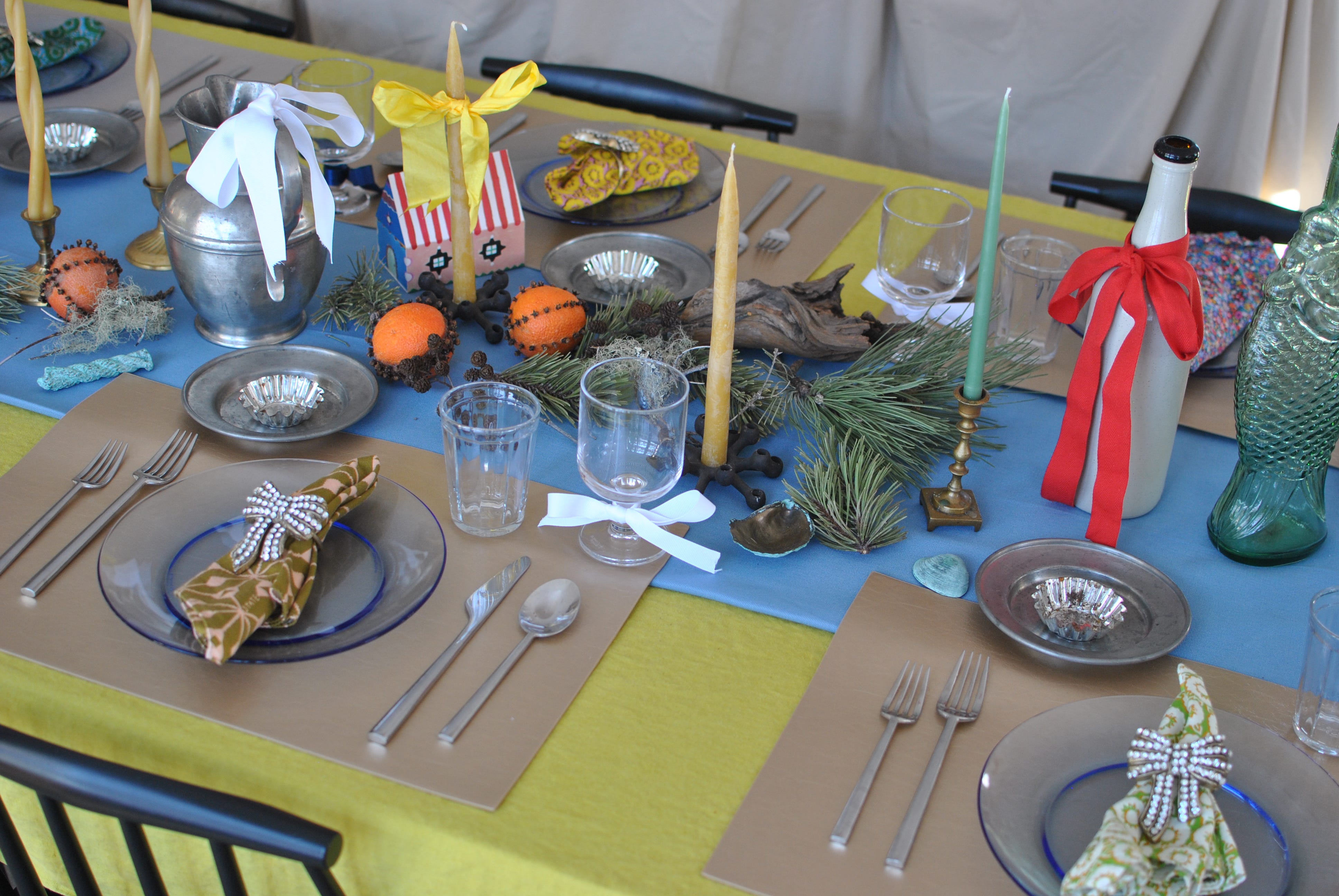
I gave this issue the unofficial title of “The Feast Issue,” because that’s sort of what we do at this time of year. For this issue, I was pretty focused on the process of table-setting for a group and exploring the design spectrum from minimal to over-the-top. I started by setting the table in what felt like a nice, but minimal, if spartan setup, then page-by-page slowly turned up the amount of decoration and table clutter. Sort of a fun experiment and I wonder, for those who see it, if there’s a particular point where your own aesthetic instinct says, ok, that’s enough now.
Now! There’s January about ready to ship as well, but we’ll preview it another time since this was a pretty hearty snack.
As usual, if you want one to come to your mailbox (along with some other paid perks I’m working on presently), you can upgrade from free to paid by tapping the button below. Either way, I am extremely glad you are here.

I’m still trying to figure out what the chat feature *is for* so why not join me over there and we can figure it out together! There was previous enthusiasm for a book club, maybe that’s where it lives? I don’t know, but let’s just play and see what happens.

Pine fans, don’t sleep on this beautiful bar/hutch/general storage unit near Colby. (LINK)
Pair of cuties in New Mexico. (LINK)
Who wants a wee adorable (but real!) Japanese firetruck?! (LINK)
Actively seeking good sites and message boards that aren’t in the Zuck-o-sphere from which to serve you these lil listings… If you have a tip or a great place for me to look up, pass it along!